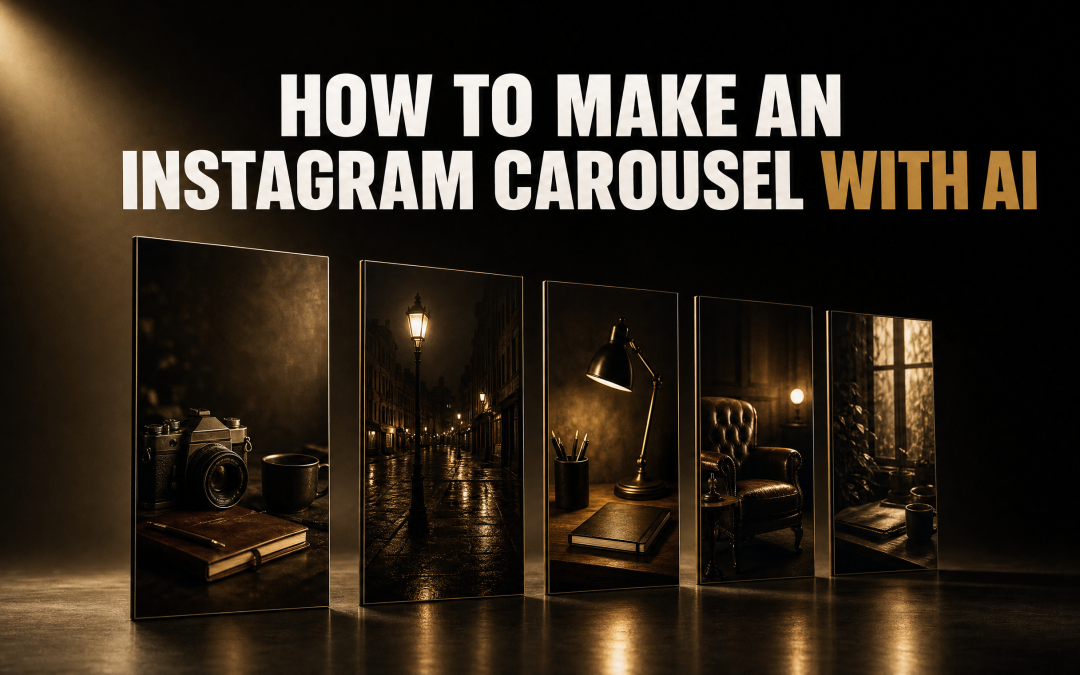
Five slides. Forty three image credits. Roughly twenty minutes from an empty prompt box to something I would actually post.
That is the whole experiment, and the interesting part is not the finished carousel. It is the middle bit, where the first attempt came back so plain that most people would have closed the tab and gone back to Canva. Learning how to make a carousel on Instagram with AI is really about learning what to do at that exact moment.
Here is the full process, the numbers it cost, and the one step that decides whether your slides look like everyone else's.
Why Most AI Carousels Look The Same
You can ask any AI tool for a five slide carousel and get one back in about two minutes. It will be centred text on a cream background with a big number in the corner. It will be fine. It will also look exactly like the one the next person asked for.
There is nothing wrong with that as a starting point. However, it is a starting point, and most people treat it as the finished job. That is the gap.
The reason is simple enough. You gave the tool a topic and nothing else, so it reached for the safest, most average design in its training. No brand, no reference, no rules. In other words, you asked a stranger to design for a business they have never heard of, and they gave you the beige answer.
How To Make A Carousel On Instagram With AI, Start To Finish
I used Claude Fable 5.1 with Claude Design switched on, plus Higgsfield for the artwork. The steps below work the same way whichever tools you land on, because the order is what matters, not the brand names.
Worth knowing before you start: Instagram lets you put up to 20 photos or videos in a single feed post. Five is a sensible working number. It is enough to tell a story and short enough that people actually swipe to the end.
Step 1: Ask For The Obvious Thing First
My opening prompt was deliberately bare. Five slides, AI marketing for small business owners, focus on the benefits, and specifically do not draw on any memory about a brand. I wanted to see the honest default.
It came back in a couple of minutes. Very basic, very bland. Nothing amazing about it.
That is not a failure. That is the baseline, and you need to see it, because everything after this is measured against it. Skip this step and you will not know whether the design work actually did anything.
Step 2: Go And Find A Look Before You Write Another Word
This is the step people skip, and it is the one that does the most work.
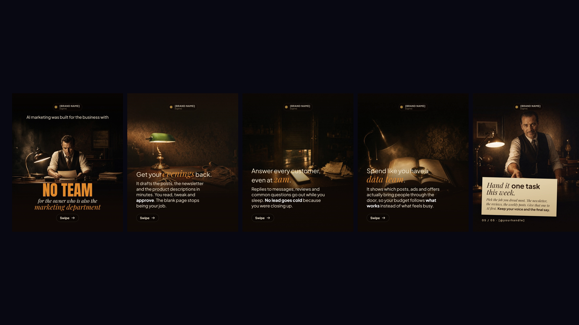
I went to Pinterest and searched for social media carousels cinematic. Not to copy one, but to find a direction I could point at. I picked a single reference with the mood I wanted, a sort of 1930s office at midnight feeling, and copied it.
You do not need to be a designer for this. You need to be able to recognise what you like when you see it. That is a much lower bar and everyone clears it.
Step 3: Make It Write The Design Rules Down
Here is the part that changes everything, and it is one prompt.
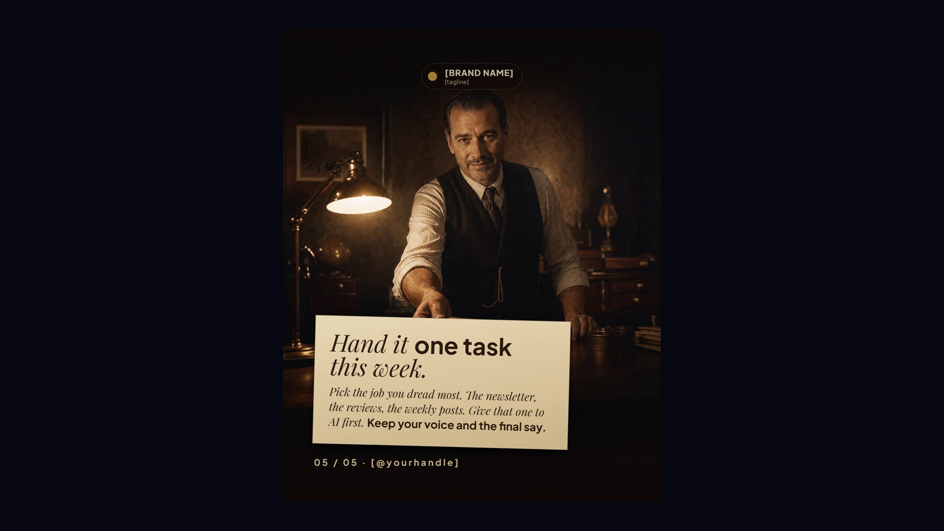
Instead of asking for slides, I asked it to build a design system page. One HTML page carrying the colour palette, the textures, the typography, the components and the rules for using all of them, derived from that reference image.
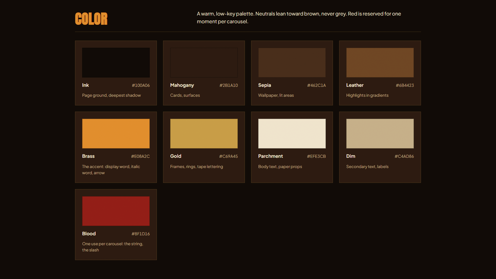
What comes back is not a carousel. It is the rulebook a designer would have written before touching a single slide. Nine named colours with hex codes. Three typefaces with a job each. A rule that the accent colour lands on one word per slide and no more.
Furthermore, it wrote its own do-not list. No emojis, no icon sets, no cool greys, no pure black backgrounds. I did not ask for that. It worked out that consistency needs constraints and then set them.
Now every future carousel has something to be consistent with. That is the difference between one nice post and a feed that looks like it belongs to the same business.
Step 4: Generate The Art, Not Just The Text
With the rules in place, I asked it to generate the images through its Higgsfield connection, using the GPT Image 2 model, and to follow the design system it had just written.
One instruction here matters more than it sounds. I asked for the images only, and to leave the text editable. That means the artwork is generated but every headline, every body line and every caption stays as live text I can change afterwards. You get the look without giving up control of the words.
Step 5: Look At What Came Back And Fix It
Five images came back. Three were right immediately. Two were not.
On slide one you could barely see the person, because the text overlay sat straight across them. On the last slide the same thing, a text box covering the part that made the image work. So I said exactly that, in plain English, and asked it to move things around.
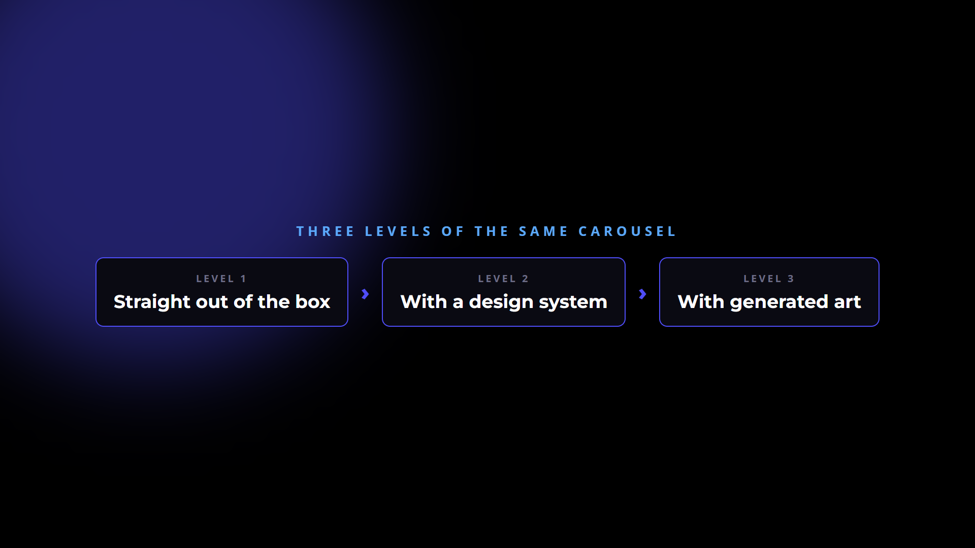
That is really the whole loop. Look at it, say what is wrong in the way you would say it to a person, let it adjust. You are not prompting, you are art directing.
What It Actually Cost
This is the number people never quote, so here it is.
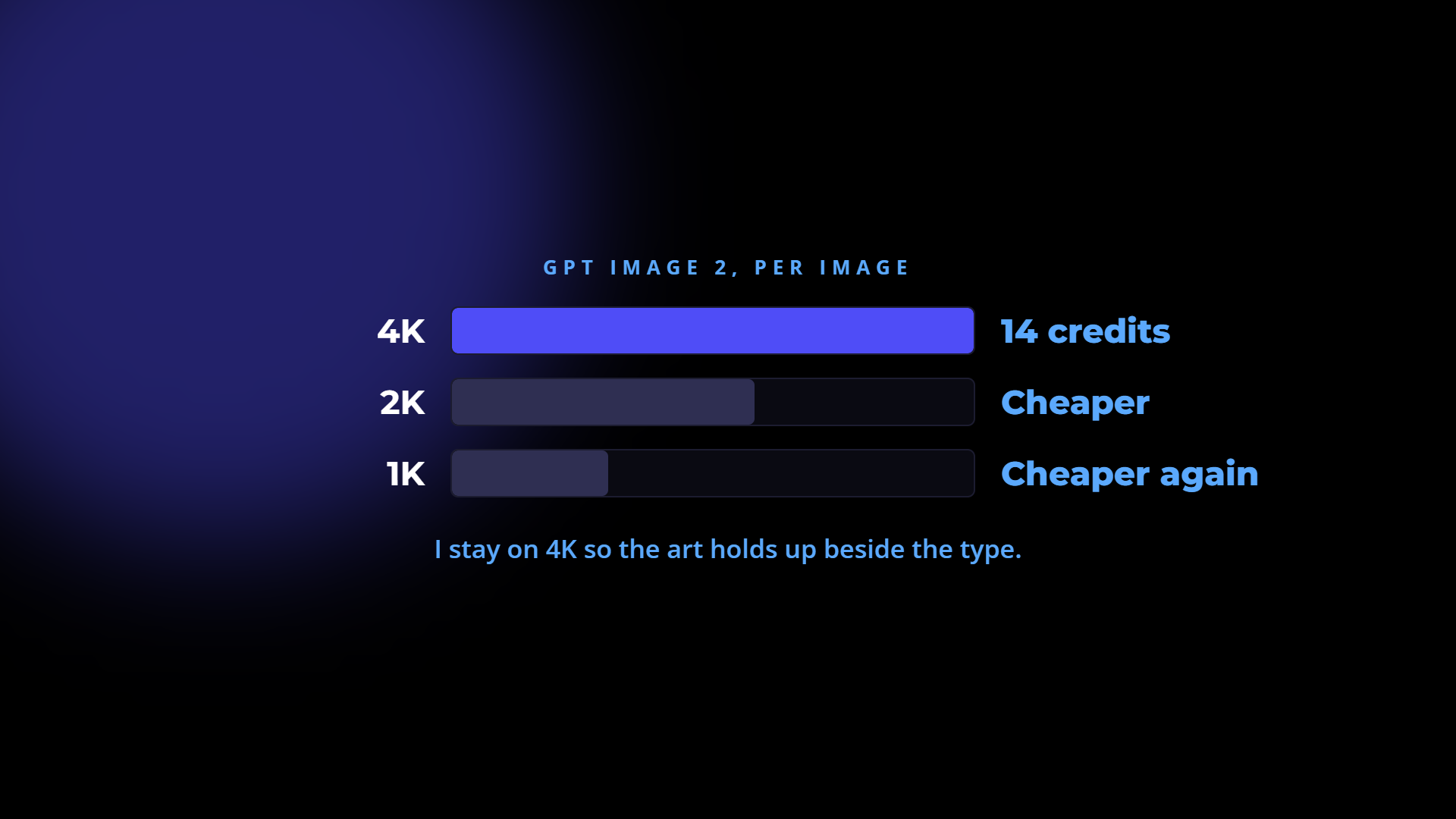
The five images cost 43 credits on Higgsfield. I generated at 4K, which runs at 14 credits per image, and you can drop to 2K or 1K if you want it cheaper. I stay on 4K because the artwork has to hold up next to the type, and that is where a cheap render shows.
There is one other cost worth flagging, because it caught me out. Claude Fable 5.1 does not run on your normal plan. You have to top up separate usage credits on top of whatever you already pay. I think that is an awful thing to build into a model and it limits how much people will use it, but it is the situation, so budget for it before you start.
Turn It Into A One Line Command
Doing this once is a nice afternoon. Doing it every week is a business asset.
Because the design system is now a file, the whole process can be saved as a reusable command. Something like /design create a carousel on [topic], where the rules, the palette and the image style are already loaded and only the subject changes.
So the second carousel takes a fraction of the time the first one did. The third takes less again. That is the actual return here, and it only exists because you made it write the rules down in step three.
The Short Version
If you take one thing from this, take the order:
- Ask for the obvious version and look at how plain it is.
- Go and find a reference you actually like.
- Make it write the design rules down as a document.
- Generate the artwork against those rules, keeping the text editable.
- Art direct the results in plain English.
- Save the whole thing as a repeatable command.
Steps one, four and five are what everyone does. Steps two, three and six are what makes the difference, and they are the ones that get skipped.
Frequently Asked Questions
How many slides should an Instagram carousel have? Five is a good working number. Instagram allows up to 20, but five is enough to carry a beginning, three points and a close, and short enough that people reach the last slide.
Do I need to be a designer to make a carousel with AI? No. You need to recognise a look you like and describe what is wrong with a draft. Both of those are ordinary skills. The design rules are written by the tool once you point it at a reference.
Why does my AI carousel look generic? Because you gave it a topic and no reference. Without something to aim at, it produces the most average design it knows. Give it one image you like and ask it to write a design specification from that image first.
How much does it cost to make a carousel with AI? The five images in this build cost 43 credits, generating at 4K. Lower resolutions cost less. Separately, Claude Fable 5.1 requires usage credits topped up on top of your existing plan, which is a cost people do not expect.
Can I still edit the text after the AI makes the slides? Yes, if you ask for it. Request the images only and specify that the text layers stay editable. You can then change any headline, font, size, position or colour without regenerating the artwork.
How do I keep every carousel looking like the same brand? Save the design specification as a file and reuse it. Every later carousel is generated against the same palette, typefaces and rules, which is what makes a feed look deliberate rather than assembled post by post.
Disclosure: Some links in this article are referral links. If you use one, I may earn a commission at no extra cost to you. I only link to tools I actually use.
How this was made: The facts, numbers and examples in this article come from my own work and videos. I use AI to help draft and structure the writing, then I review and edit every line myself before it goes live.

About the author
I'm Wayne St Ledger, and I run St Ledger Marketing. I started out in construction as a plasterer, then went on to a Bachelor's in Marketing and a Master's in International Business, which is where my bias toward results over talk comes from. I help business owners build marketing systems they actually understand, using AI in grounded, practical ways rather than hype. I also run a YouTube channel on marketing and AI, and The AI Marketing Hub, my own community for business owners and marketers putting AI to work properly.