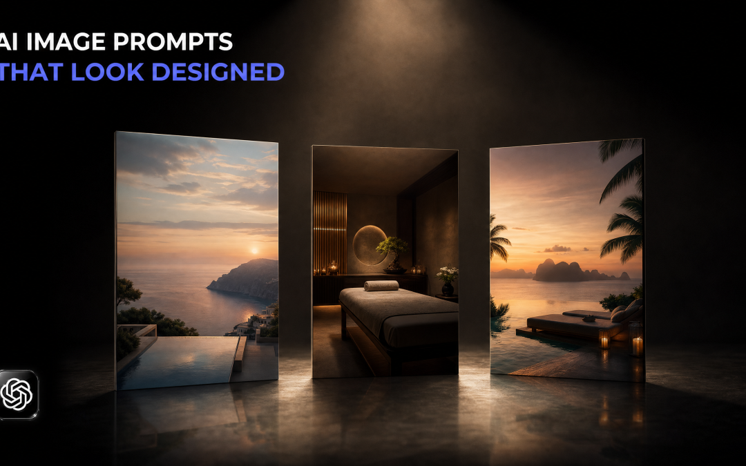
You have seen these images. Same glossy background, same gold swirls, same four little icons in a row, same everything crammed into one frame. They have been all over social media for about six months now.
Individually they look fine. Put twenty of them together in a feed and they are indistinguishable.
The problem is not the tool. The problem is the instruction.
What Makes AI Image Prompts Produce Generic Results
Most AI image prompts fail for one reason: they hand the tool everything at once and ask it to decide what matters.
The typical prompt is a paragraph. The business name, the offer, the price, the four things included, the tagline, the call to action, the opening hours. Then "create an image for me". The tool obediently puts all of it in, because that is what it was asked to do, and the result is a poster where nothing is more important than anything else.
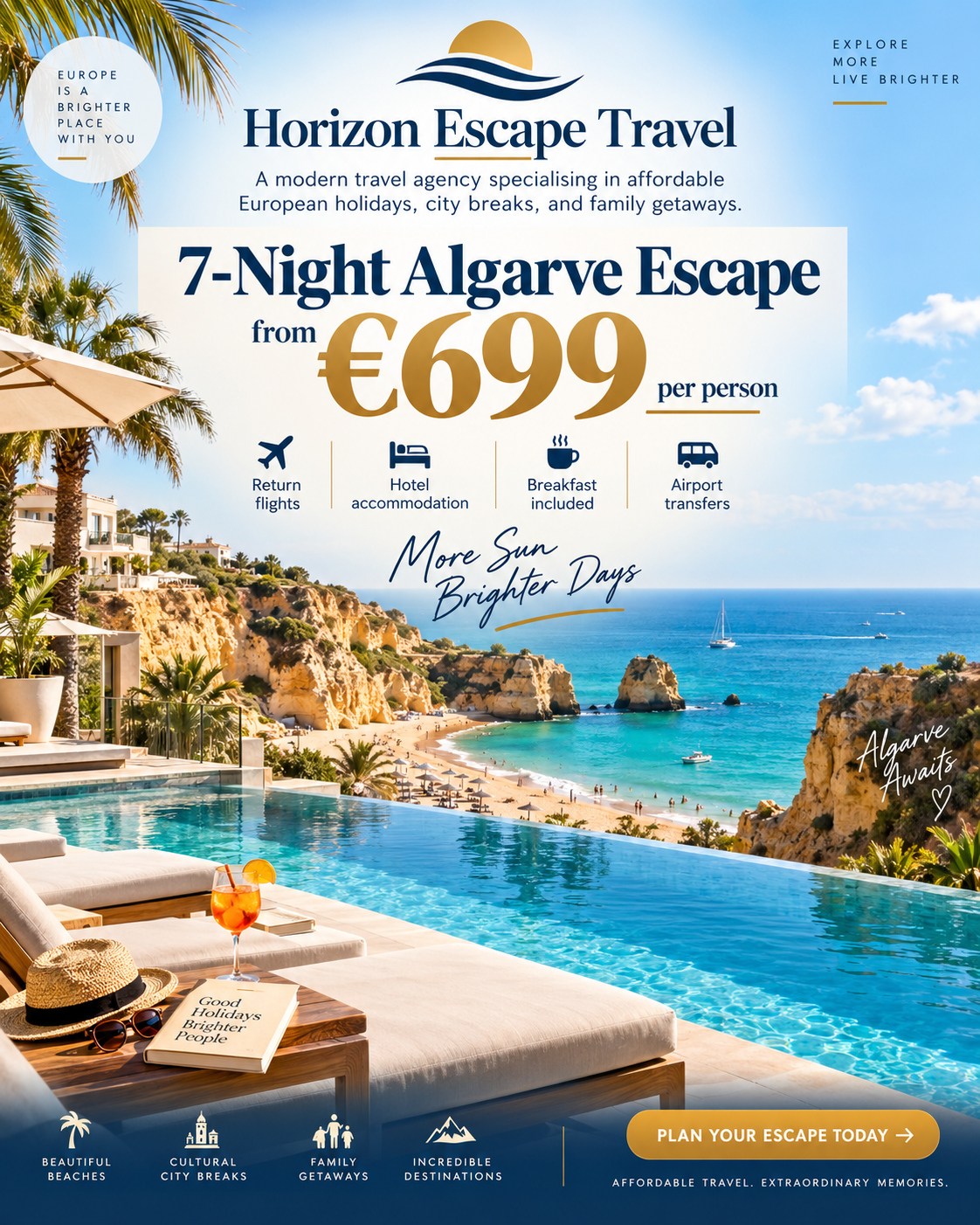
Every element on that image is competing with every other element. There is no entry point. Your eye does not know where to land, so it does not land anywhere, and the viewer scrolls.
That is what people mean by AI slop. Not that the rendering is bad, because the rendering is excellent. It is that nothing was art directed, so everything came out at the same volume.
The Five Instructions That Change The Output
I tested this on two made-up businesses: a travel agency and a beauty salon. Same approach both times. Five instructions, and only one of them is about the picture.
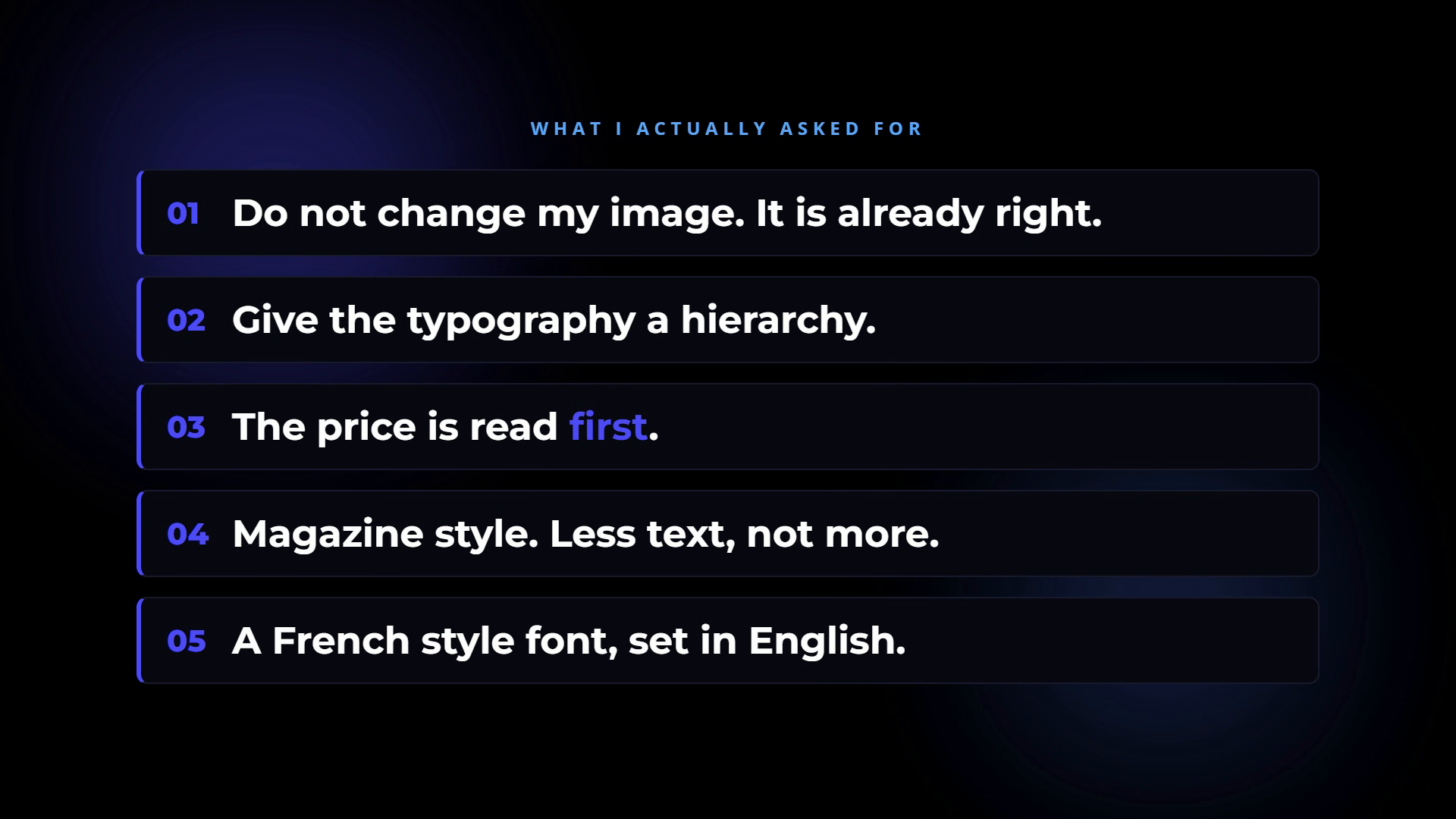
1. Do not change my image
This is the one that matters most and the one almost nobody uses.
Give the tool a photograph you already have and tell it explicitly to leave the photograph alone. "I do not want you to change anything on this. This image is perfect. This is my own actual image that I took myself."
The moment you let AI invent the scene, you get the same stock-flavoured scene everyone else gets. The moment you supply the scene, the output is already unlike anyone else's, because nobody else has your photograph. A salon with its own reception shot, a restaurant with its own plate of food, a gym with its own floor. That alone separates you from every other business using the same tool.
If you genuinely have no photographs, generate a set of plain background images first and reuse them. Plain ones. The job of that image is to sit behind type, not to be the whole advert.
2. Give the typography a hierarchy
Not "make it look nice". Hierarchy.
You are telling the tool that some words are more important than others and that the difference should be visible. This is the single instruction that separates a designed image from a decorated one, and it costs you six words.
3. Say what gets read first
Hierarchy is meaningless unless you say what sits at the top of it. For an offer, it is almost always the price.
"The focus here should be on the pricing first. The reader should be able to go straight to the price, and from there the typography leads where they read next and the order it is read in."
You are describing a reading path, not a layout. The tool is good at building a layout once it knows the path.
4. Magazine style, and less text
"Magazine style" is a useful shorthand because it carries a whole set of conventions with it: generous space, restrained type, one dominant element, a photograph that is allowed to breathe.
Then cut. Tell it the text should be sparse, and tell it what to leave out. I removed the business name from one of these entirely. On a social post the account name is already on screen above the image, so printing it again inside the image is wasted space. Gimmicky icons went too.
Most prompts are a list of what to include. The useful part is usually the list of what to drop.
5. Point at a style you actually want
You can name one, as I did with a French style font for a Paris offer. But a name is a guess, and you will often not like what comes back.
The better move is to show it. I found a font I liked on a font site, screenshotted it, and put the screenshot into the chat with "use this similar font style for the typography". It pulled the style straight in.
A screenshot is a far more precise instruction than an adjective. This works for layout references too. If you have seen an advert you like, show the tool the advert.
What The Same Offer Looks Like After
Same business. Same price. Same four inclusions. One photograph, five instructions.
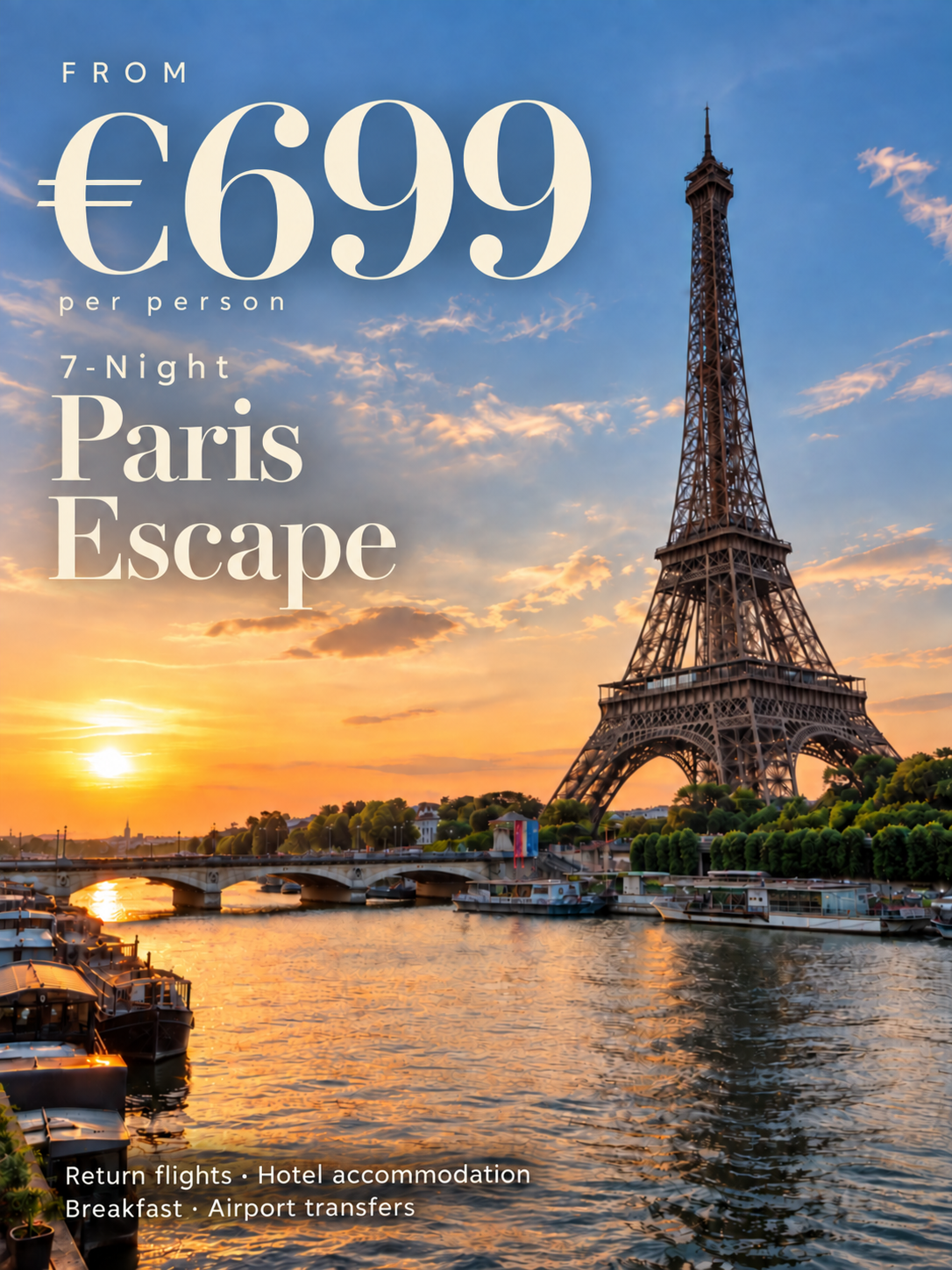
The price is doing the work. The destination sits under it. The inclusions are there for anyone who wants them but they are not shouting. There is no logo, no tagline, no icon row, no button.
It is not that the second image contains better ingredients. It contains fewer, arranged in an order.
It Is Not Perfect, And That Is Fine
I would still change things on both of mine. The typography on the salon one needed another pass, and the font it chose was close to my reference rather than exactly it.
That is worth saying plainly, because the useful version of this is not "type five lines and get a finished advert". It is that you now have something with a structure you can criticise. "The price should be bigger" is a fixable note. "It looks like AI made it" is not.
The two images above took about twenty minutes, including the time spent working out what to ask for.
Where The Real Saving Is
The twenty minutes is not the point. The point is the second time.
Once a prompt produces something you are happy with, that prompt is now an asset. Save it. Reuse it with a different photograph and a different offer next week. If you work in one industry, you will find that the same five instructions plus a new picture gets you most of the way there every time, and the twenty minutes becomes two.
This is the bit most people skip. They treat every image as a fresh conversation with the tool, start from nothing each time, and wonder why the output keeps drifting back to generic. The businesses getting consistent images are not writing better prompts each time. They wrote one good prompt and stopped rewriting it.
Try This On One Image
Take one photograph you already own. Not a stock image, one of yours.
Give it to whichever AI tool you use with those five instructions: leave my photo alone, give the typography a hierarchy, the price gets read first, magazine style with less text, and here is a screenshot of the style I want.
Compare it to the last graphic you posted. That comparison will tell you more than another article will.
If you want to go deeper on using AI properly in your marketing, that is what I teach inside The AI Marketing Hub. There is a 7 day free trial if you want a look around first.
Disclosure: Some links in this article are referral links. If you use one, I may earn a commission at no extra cost to you. I only link to tools I actually use.
How this was made: The facts, numbers and examples in this article come from my own work and videos. I use AI to help draft and structure the writing, then I review and edit every line myself before it goes live.

About the author
I'm Wayne St Ledger, and I run St Ledger Marketing. I started out in construction as a plasterer, then went on to a Bachelor's in Marketing and a Master's in International Business, which is where my bias toward results over talk comes from. I help business owners build marketing systems they actually understand, using AI in grounded, practical ways rather than hype. I also run a YouTube channel on marketing and AI, and The AI Marketing Hub, my own community for business owners and marketers putting AI to work properly.